Top Poster Designs Inspired by the Series
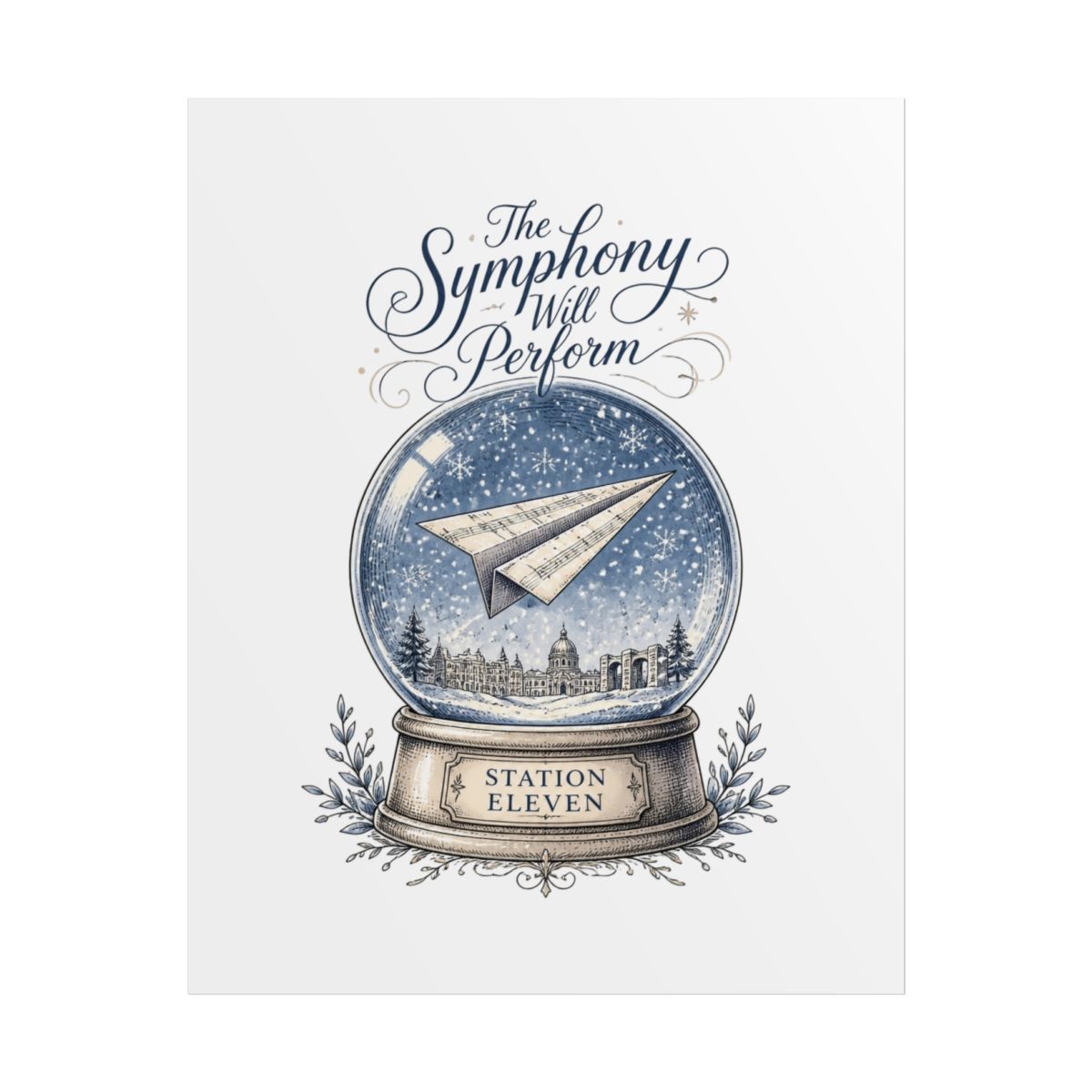
The best designs do not just reproduce stills. They distill the mood into a single frame. My favorites include the Traveling Symphony poster with its weathered texture and vintage tour dates, the red bird emblem from Miranda's graphic novel, and typography pieces built around lines like "I remember damage."
Quiet scenes that translate best to print
Action sequences rarely make great wall art. Station Eleven lives in quiet scenes: a forest at dusk, a frozen airport, a stage lit by candles. These scenes print beautifully because they have subtle gradients and lots of negative space. They also stand out on a wall without shouting.
Typography designs that age well
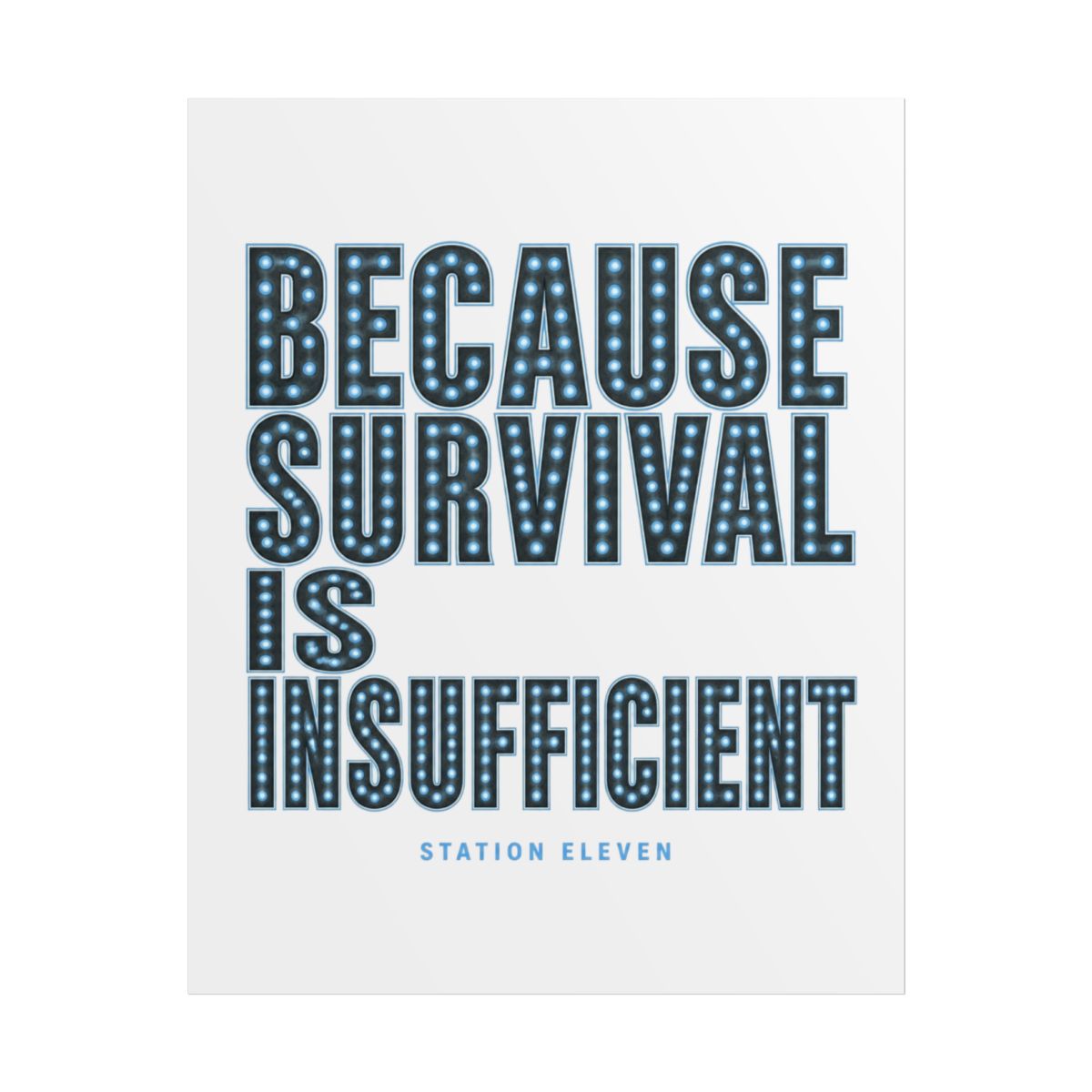
Quote-heavy posters can feel like dorm room decorations. The good ones are designed with restraint. Look for "Survival is insufficient" layouts that use small caps, wide spacing, or a distressed letterpress look. That attention to typography makes the phrase feel more like a mantra and less like a bumper sticker.
Five designs that keep showing up in fan collections:
1. The Traveling Symphony tour poster - distressed paper texture, smoky colors.
2. The red bird graphic - minimal, elegant, instantly recognizable.
3. The comet logo - a clean astronomical shape with a quiet glow.
4. The Museum of Civilization floor plan - adds literary depth.
5. Typography art built around "Survival is insufficient" - careful lettering.
The strongest versions of these are giclée prints on 200 gsm matte paper or heavier. Giclée printers apply tiny droplets of archival pigment, which gives even a simple design the depth of a gallery piece. If you see a poster printed on glossy copy paper, keep scrolling.